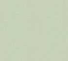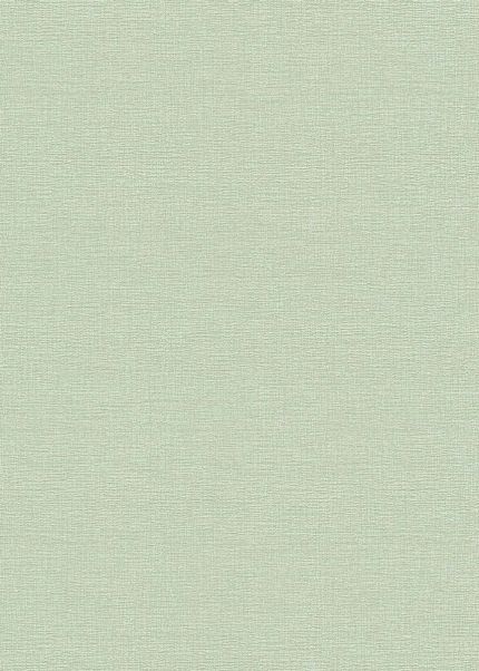
Marius Pastel Green
Also available in:

Marius Pastel Green is a plain wallpaper in a soft, pale green. There is no motif and no repeat to line up, so the color covers the wall evenly from corner to corner. The shade is light enough to read as a neutral in most rooms, with just enough green in it to keep the wall from looking flat white or gray.
Color and pattern
Solid colors give you a plain background to work against, which makes them useful when the furniture, artwork or textiles are meant to be the thing you notice. A pastel tone also reflects light rather than absorbing it, so a room papered in this green stays bright through the day. The color shifts slightly depending on the light it gets: cooler and grayer in a north-facing room, warmer where the sun comes in directly. If you are comparing options, it sits within the wider range of green wallpapers, and the rest of the solid color selection is worth looking through as well. These are premium quality wallpapers.
Style and rooms
The design belongs to minimalist interiors and to Japandi schemes built on light wood, low furniture and a small number of colors. It pairs with oak, rattan, linen and matte black fittings without competing with any of them. Used on all four walls it keeps a room quiet; used on one wall it marks a section off without introducing a pattern.
- Living rooms, including the wall behind a sofa
- Bedrooms, on full walls or a single one
- Kitchens and dining areas
- Hallways, entryways and home offices
In a living room the plain surface works well behind shelving or a TV unit, where a busier design would fight with the objects in front of it. In a hallway the pale tone helps a narrow space read as wider, and in a home office it gives a calm backdrop for video calls.
French design meets German engineering, made entirely in Europe.