
Irma Cream

Also available in:
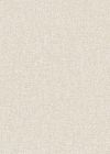

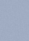
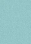
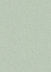
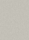
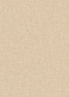
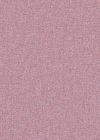
Irma Creme is a plain wallpaper in a warm cream shade, with no motif or repeat to line up. The color sits between white and beige, so it reads as a soft neutral rather than a stark one. Because there is no pattern, the wall works as a single continuous surface, and the interest comes from the texture and the way light falls across it.
Surface and finish
The look is matte, which means no reflected highlights and no shiny patches near windows or lamps. The cream tone stays consistent from one end of a wall to the other and shifts only with the daylight. A textured surface gives the paper a fine, tactile relief that breaks up flat expanses of color and helps hide minor unevenness in the wall beneath. These are premium quality wallpapers. If you like uninterrupted color, the rest of the solid wallpapers are worth comparing, and the full range of cream shades shows how wide that family is.
Style and rooms
The shade and the quiet surface suit Japandi interiors, where pale walls, light wood and low furniture do most of the work. It also fits minimalist schemes that rely on one background tone throughout. Cream pairs well with oak, rattan, black metal fittings and linen, and it gives framed prints, plants or a patterned rug a clear backdrop instead of competing with them.
- Living rooms, including behind a sofa or around a TV unit
- Bedrooms and nurseries
- Kitchens and dining rooms
- Hallways, home offices and bathrooms
In a dark hallway the light tone makes the space feel more open without going bright white. In a bedroom it keeps the walls calm, and it can be used across all four walls or combined with a single patterned one.
French design meets German engineering, made entirely in Europe.