Faustine Blue
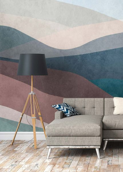
Faustine Blue is an abstract wallpaper worked in white and gray. The design has no repeating motif to pin down, so the eye follows the shapes across the wall rather than counting rows. Because both shades sit in the neutral range, the pattern stays readable without pulling color into the rest of the room.
Pattern and color
The white areas carry most of the light, while the gray passages give the composition its structure and depth. That contrast is the whole effect here: there is enough difference between the two tones to keep the abstract forms distinct, and not so much that the wall turns graphic or hard. Gray also shifts with daylight, reading cooler in a north-facing room and softer under warm lamps in the evening. These are premium quality wallpapers. On a single accent wall the pattern has room to be seen in full, which suits an abstract design better than spreading it across four walls.
Style and rooms
The maximalist character comes from the scale and density of the drawing rather than from color, which makes it easier to live with than most bold patterns. It holds up next to velvet upholstery, dark wood, brass fittings and layered textiles, and it also works in plainer schemes where it is the only pattern present. In a living room it pairs with gray or charcoal seating and white trim; behind a sofa the neutral palette keeps cushions and throws visible instead of swallowing them.
- Living rooms, full wall or single feature wall
- Bedrooms, including behind the headboard
- Hallways and stairwells
- Home offices and study corners
In a bedroom the white and gray combination stays quiet enough for a room used for sleeping, and in a hallway the abstract forms give a narrow space something to look at. A home office benefits from the same restraint, since the pattern sits behind a desk or shelving without competing with what is on the wall in front of it.
French design meets German engineering, made entirely in Europe.